
— CREATIVE WORK
Print Materials — Flyers, Brochures & Greeting Cards
3 piece types for 1 client, ongoing — Healthcare
— THE COLLECTION
A closer look
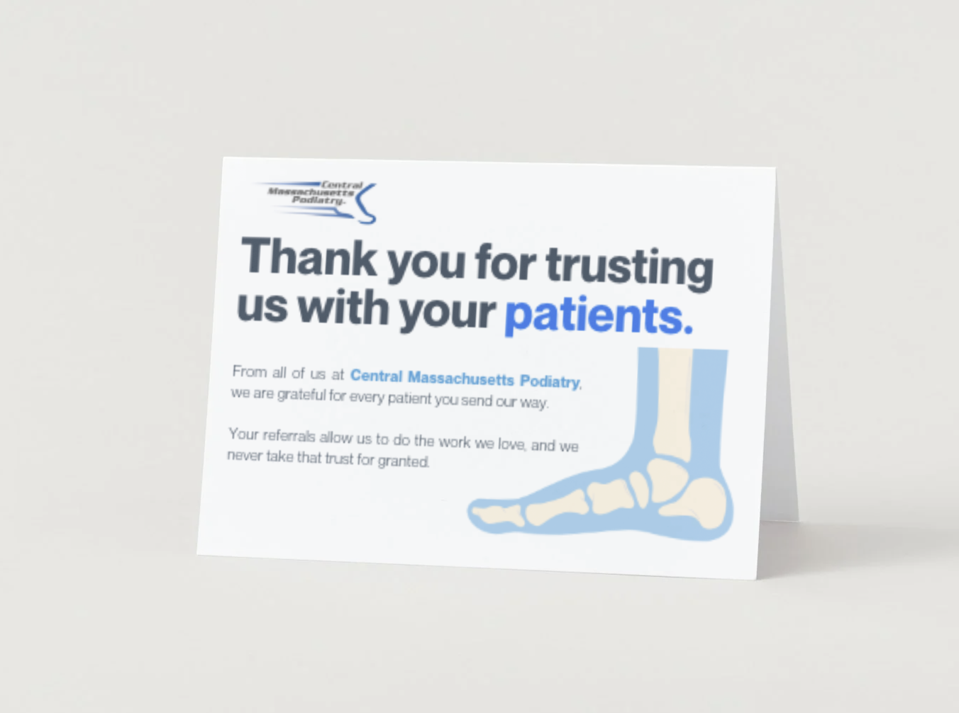
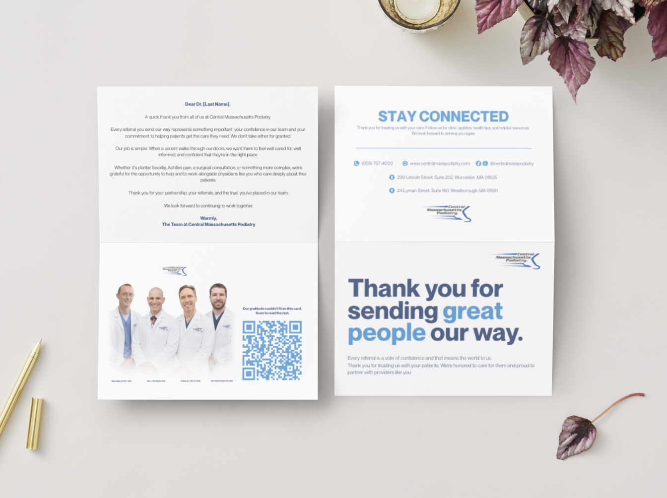
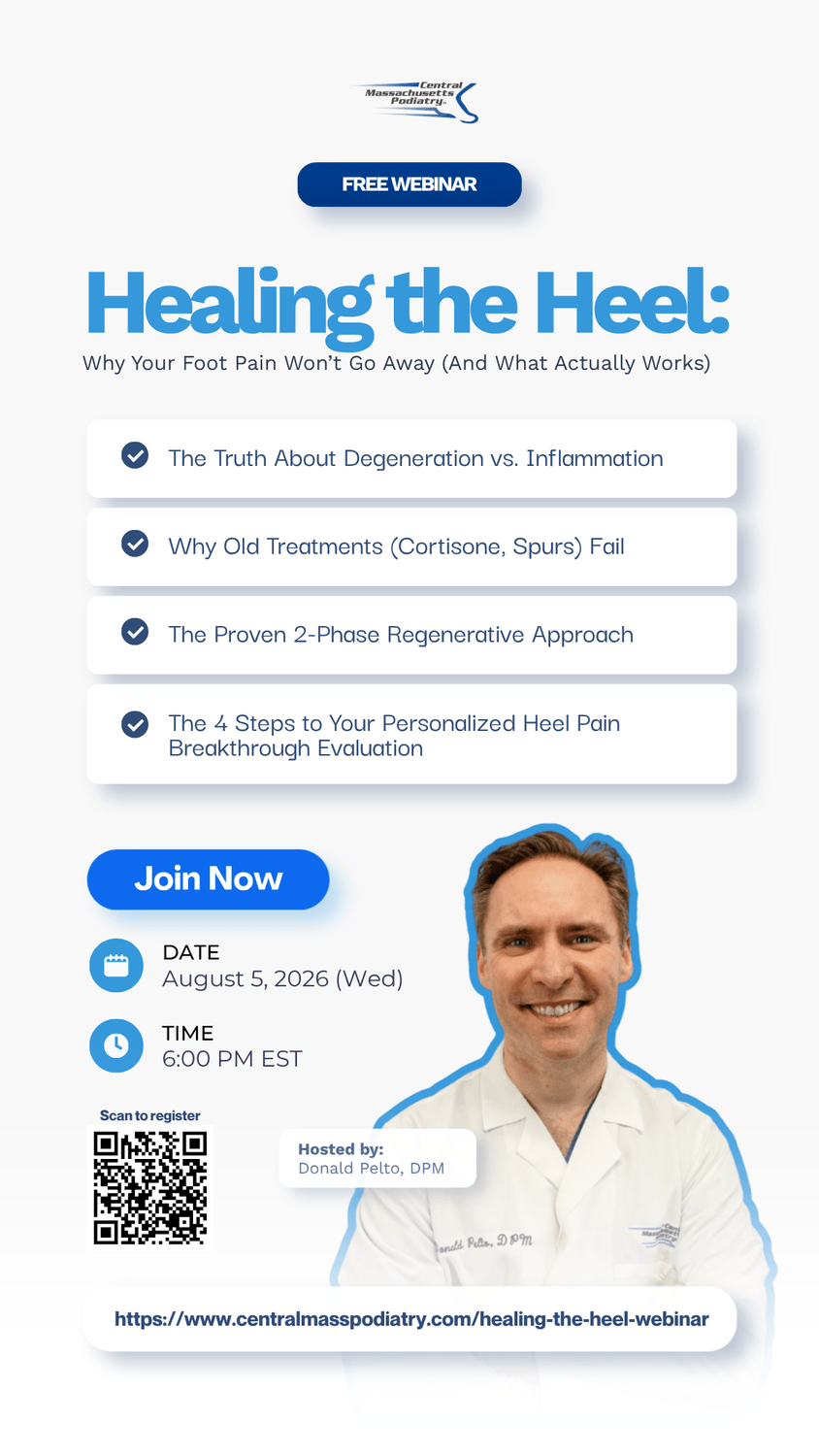
Print work for Central Massachusetts Podiatry, produced as part of the same ongoing content system behind the practice's reels and social ads — consistent branding carried into physical, patient-facing formats.
— WHAT I DELIVER
Physical touchpoints, same visual system
Print pieces follow the same branding used across the practice's digital work, so a patient encounters one consistent identity whether they're looking at a screen or holding something in hand.
Research
Reviewed drop-off points with the front-desk team.
Strategy
Reframed the flow around symptoms, not internal terms.
Architecture
Mapped a path with one decision visible at a time.
Wireframes
Tested the new flow before visual design.
Design
Applied the visual system throughout the experience.
Development
Built the experience inside the client's platform.
Automation
Connected reminders and follow-ups to reduce no-shows.
Launch
Delivered documentation and post-launch support.
Research
Reviewed drop-off points with the front-desk team.
Strategy
Reframed the flow around symptoms, not internal terms.
Architecture
Mapped a path with one decision visible at a time.
Wireframes
Tested the new flow before visual design.
Design
Applied the visual system throughout the experience.
Development
Built the experience inside the client's platform.
Automation
Connected reminders and follow-ups to reduce no-shows.
Launch
Delivered documentation and post-launch support.
— HOW I APPROACH THIS
Designed for a shelf or a mailbox, not a scroll
Print pieces get one look, often without a second chance — the design has to work at a glance, and the file has to be production-ready with no back-and-forth.
Research
Understand where each piece will actually be seen — front desk, mail, in-hand referral — before designing.
Concept
Decide the one thing each piece needs to communicate at a glance.
Layout
Design within the practice's existing visual identity, so print matches everything else patients see.
Production Specs
Prepare print-ready files — bleed, margins, and color settings — so there's no back-and-forth with a printer.
Proofing
Review a final proof before anything goes to print.
Delivery
Deliver final, print-ready files for the client's printer of choice.
Research
Reviewed drop-off points with the front-desk team.
Strategy
Reframed the flow around symptoms, not internal terms.
Architecture
Mapped a path with one decision visible at a time.
Wireframes
Tested the new flow before visual design.
Design
Applied the visual system throughout the experience.
Development
Built the experience inside the client's platform.
Automation
Connected reminders and follow-ups to reduce no-shows.
Launch
Delivered documentation and post-launch support.
Research
Reviewed drop-off points with the front-desk team.
Strategy
Reframed the flow around symptoms, not internal terms.
Architecture
Mapped a path with one decision visible at a time.
Wireframes
Tested the new flow before visual design.
Design
Applied the visual system throughout the experience.
Development
Built the experience inside the client's platform.
Automation
Connected reminders and follow-ups to reduce no-shows.
Launch
Delivered documentation and post-launch support.
— WHY IT MATTERS
Print extends trust into a physical touchpoint
A referral card handed to a patient, or a brochure sitting at the front desk, carries the practice's brand somewhere a screen can't — into a physical moment of trust. Keeping that consistent with the digital work means the brand doesn't feel different depending on where someone encounters it.
— MORE CREATIVE WORK
Other categories worth a look.


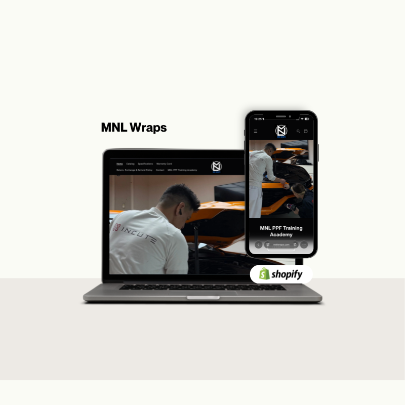
A premium Shopify storefront built to showcase custom vehicle wraps and drive qualified inquiries.
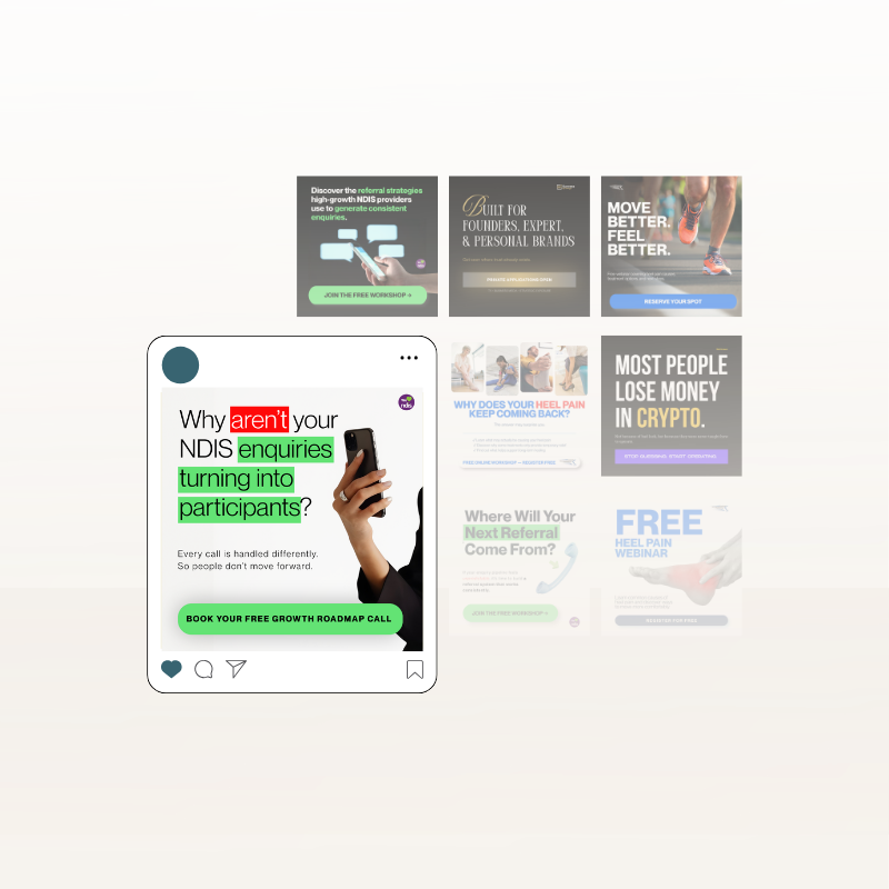
Cohesive social media creatives designed to strengthen brand identity and boost audience engagement.
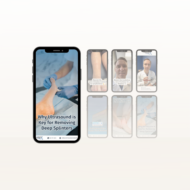
Engaging promotional videos and short-form edits crafted to capture attention and increase engagement.
NEED SOMETHING LIKE THIS?