Project 09 — 2026
— CASE STUDY
Rebuilding a promo page that read like a brochure
Plantar Fasciitis Page Redesign — Central Massachusetts Podiatry — Healthcare
— THE CHALLENGE
The original promo page was built quickly, but it functioned like an educational service page, not a promo. It explained plantar fasciitis thoroughly — causes, symptoms, treatment options, FAQ — but never gave a visitor a specific reason to book right now.
It also sat inside the full site's navigation, with team and service dropdowns pulling attention away from the one thing a promo page needs a visitor to do.
— WHAT I DID
I rebuilt the page from scratch as a dedicated, standalone promo: a specific offer, urgency messaging, trust stats up front, and a repeated single call to action — replacing the long educational structure with a tighter, targeted path to booking.
An educational page answers questions. A promo page has to answer one question — why book now — and get out of the way.
— THE APPROACH
Rebuilding around one offer, not a full explainer
The content wasn't wrong — it just wasn't built for a visitor who'd already clicked a promo link. The rebuild started by identifying what that visitor actually needed to see first.
Audit
Reviewed the original page against its actual job: converting a promo visitor, not educating a general one.
Positioning
Rewrote the framing around a single, specific offer — a free $150 assessment — instead of a general treatment overview.
Trust Signals
Added stats — years of experience, patients treated, doctor count, locations — directly under the hero, so credibility appears before any persuasion.
Symptom Recognition
Built a "Does This Sound Like You?" checklist so visitors could self-identify immediately.
Recovery Framework
Structured treatment into a named 3-phase path — Reduce & Calm, Strengthen, Maintain — replacing the old flat list of treatment options.
Simplified Navigation
Stripped the page down to its own minimal nav, removing the full site's dropdowns that pulled attention away from the offer.
Build
Built and launched the redesigned page on Kajabi.
Research
Reviewed drop-off points with the front-desk team.
Strategy
Reframed the flow around symptoms, not internal terms.
Architecture
Mapped a path with one decision visible at a time.
Wireframes
Tested the new flow before visual design.
Design
Applied the visual system throughout the experience.
Development
Built the experience inside the client's platform.
Automation
Connected reminders and follow-ups to reduce no-shows.
Launch
Delivered documentation and post-launch support.
The new page finally feels like a promotion instead of a brochure. It's simpler, but it does more of the work than the old one ever did.
CENTRAL MASSACHUSETTS PODIATRY
— THE RESULT
Consistent leads since launch
— WHY THIS MATTERED
A promotional page and an educational page serve different visitors
Someone clicking a promotional link has already shown interest — they don't need a full explainer, they need a reason to act now. Keeping an educational structure for a promo audience likely left conversions on the table by asking visitors to read through material meant for a different kind of reader entirely.
Know the visitor, not just the topic.
NOTES FROM THE STUDIO
— GALLERY — BEFORE & AFTER
A closer look
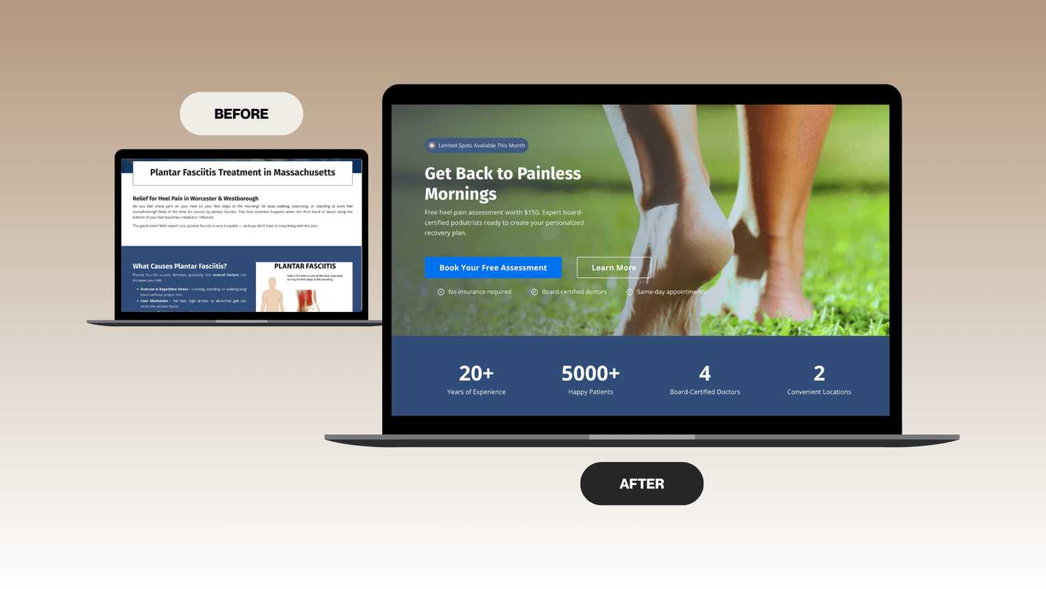
The old hero introduced the practice generally. The new one leads with urgency and a specific, valued offer — a free $150 assessment — plus trust stats immediately below it.
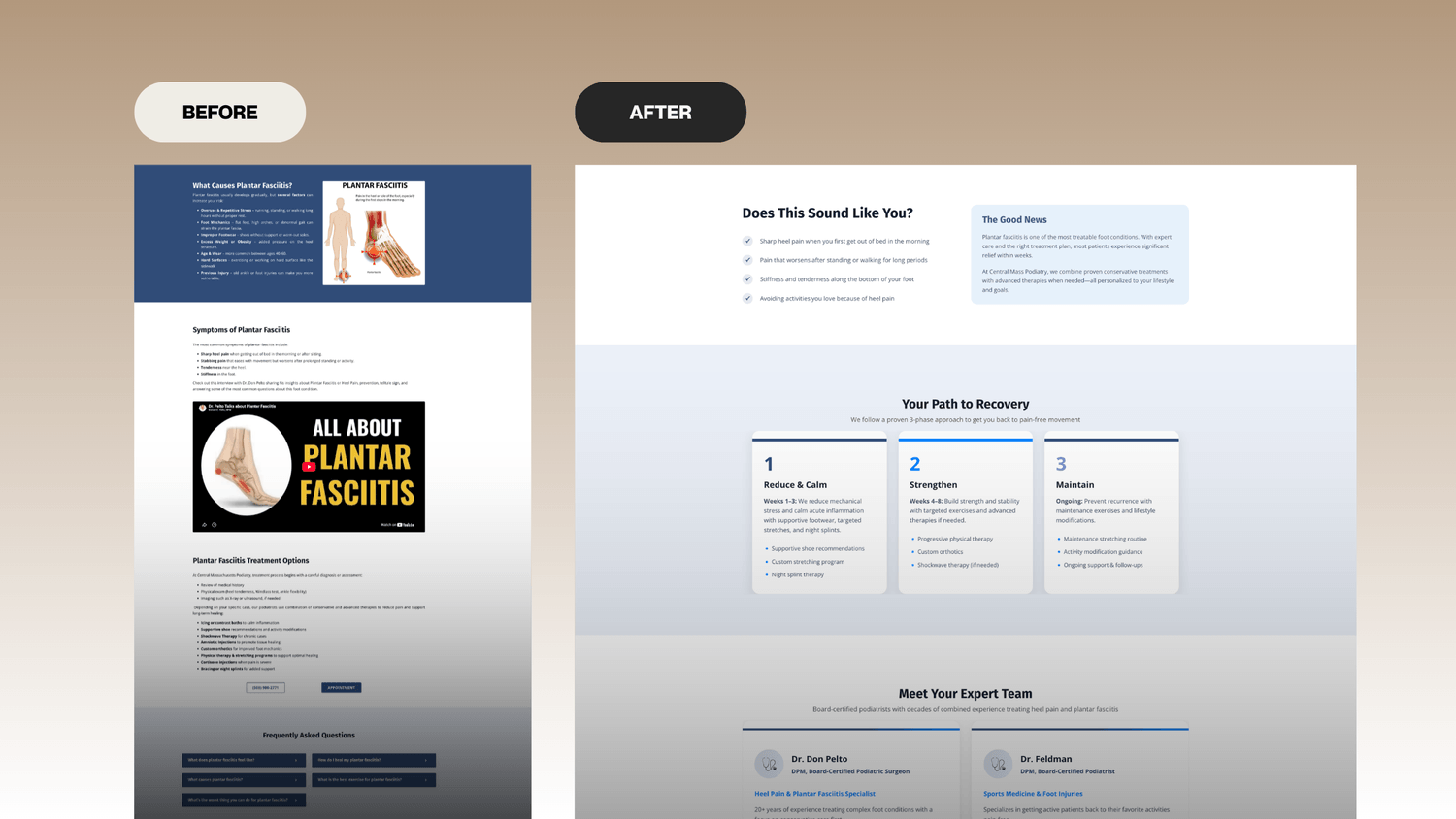
The old page walked through causes, symptoms, and treatment options in full. The new page opens with a symptom checklist, then a named 3-phase recovery path — recognition before explanation.
The old page carried the full site's navigation and a multi-step embedded form. The new page strips navigation down to three anchors and repeats one clear call to action throughout.
— REFLECTION
What I'd carry into the next project
WHAT I LEARNED
A page can be well-written and still fail at its job if the format doesn't match visitor intent — the original content wasn't wrong, it was aimed at the wrong reader.
WHY THESE DECISIONS
Stripping the navigation down was deliberate — a promo page's only job is converting on one offer, so anything that gives a visitor an exit ramp works against that.
IF I IMPROVED IT FURTHER
I'd want proper lead tracking in place going forward, so "consistent leads" could be shown as an actual number next time.
— MORE CASE STUDIES
Other projects worth a look.


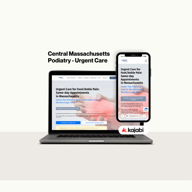
An urgent foot care landing page designed to help patients book appointments quickly and confidently.
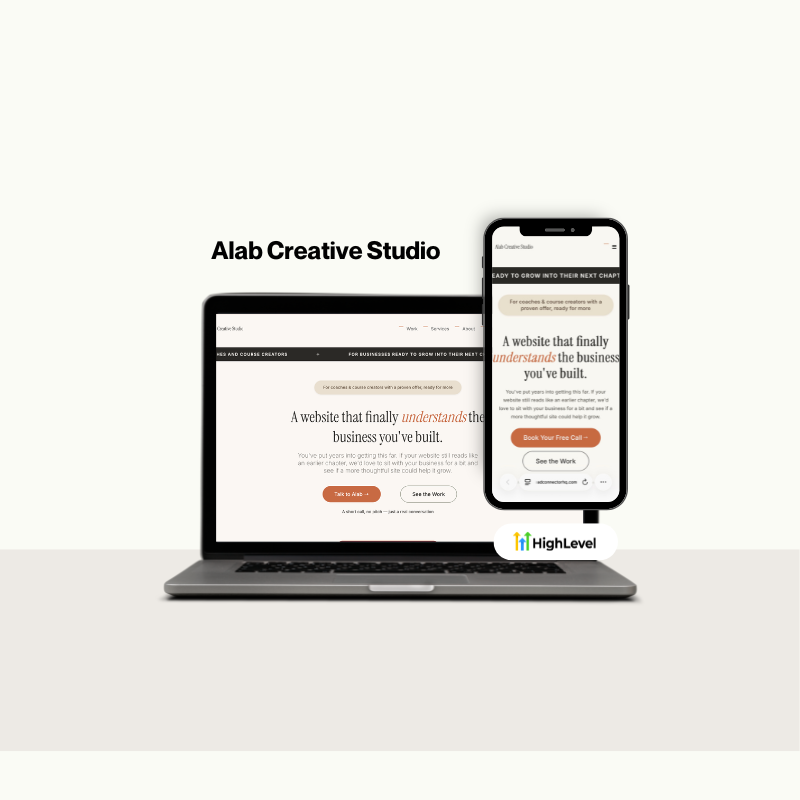
A modern creative agency website built to showcase services and establish a strong brand presence.
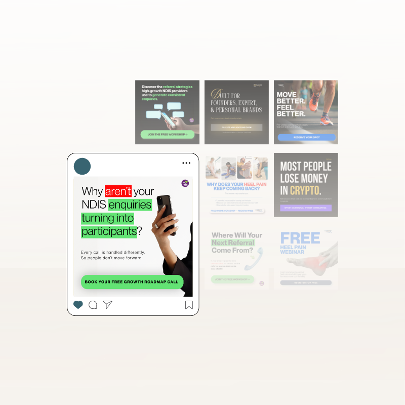
Cohesive social media creatives designed to elevate brand visibility and audience engagement.
HAVE A SIMILAR PROJECT?
Let's talk about it.