
Project 01 — 2025
— CASE STUDY
A dedicated urgent care page, built and live in three days
Urgent Foot Care Page — Central Massachusetts Podiatry — Healthcare
— THE CHALLENGE
Central Massachusetts Podiatry didn't have anywhere to send someone who needed to be seen today. Urgent and routine care lived on the same site, so a patient with a swollen ankle had to dig through the same pages as someone booking a routine check-up — with no clear signal that same-day care was even an option.
I already knew the practice well; I work with them as their VA and handle admin tasks day to day. I'd heard how often the front desk fielded the same question in different words: "can someone see me today?" There was no page built to answer that on its own.
— WHAT I DID
I built a standalone urgent care page, separate from the main site, with its own booking path. It gave stressed, same-day patients one clear answer immediately — yes, you can be seen today, by a podiatrist, not a general urgent care clinic.
Separating the page also meant separating the booking form behind it, which let the practice tell urgent visits and routine visits apart for the first time.
Someone searching for same-day foot pain isn't browsing. They're deciding between waiting it out, going to the ER, or finding a specialist who can see them now. The page only had one job: answer that fast.
— THE APPROACH
Building for a three-day turnaround without cutting corners
With three days from brief to launch, there wasn't room for a formal discovery phase — so the groundwork came from what I already knew about the practice, plus a fast look at how similar clinics handle the same problem.
Research
Drew on existing knowledge of the practice's patients and reviewed a few competitor urgent-care pages for structure.
Strategy
Decided the page needed to stand apart from the main site, not live inside it.
Information Architecture
Organized content around what a stressed patient needs to know first: can I be seen, and how.
Copywriting
Rewrote medical language into plain terms, kept simple enough for senior patients to follow without help.
Wireframes & Design
Built an easy-to-navigate layout that matched the practice's existing brand.
Build
Built the page on the practice's Kajabi platform with a booking path separate from the main site.
Automation
Connected lead capture to an instant email notification, and subscribed new leads to a foot-health newsletter.
Approval & Launch
Reviewed with the practice and launched the same day it was approved.
Research
Reviewed drop-off points with the front-desk team.
Strategy
Reframed the flow around symptoms, not internal terms.
Architecture
Mapped a path with one decision visible at a time.
Wireframes
Tested the new flow before visual design.
Design
Applied the visual system throughout the experience.
Development
Built the experience inside the client's platform.
Automation
Connected reminders and follow-ups to reduce no-shows.
Launch
Delivered documentation and post-launch support.
"Jewel did an excellent job translating complex medical information into a page that's easy for patients to understand. The process was smooth, the design matched our brand perfectly, and we're very happy with the final result."
CENTRAL MASSACHUSETTS PODIATRY
— THE RESULT
The page pulled its own traffic from day one
— WHY THIS MATTERED
A specialist page for a specialist decision
Before this page existed, a patient with sudden foot pain had two default options: wait, or go to a general urgent care clinic or ER — neither of which specializes in feet and ankles. Every one of those visits was a patient the practice could have seen directly, with on-site X-rays and a podiatrist who could treat the issue immediately instead of referring out.
Being able to separate and count urgent care visits also gives the practice something they didn't have before: a clear number to point to when deciding how to staff or market same-day care going forward.
Fast doesn't have to mean generic.
NOTES FROM THE STUDIO
— GALLERY
A closer look
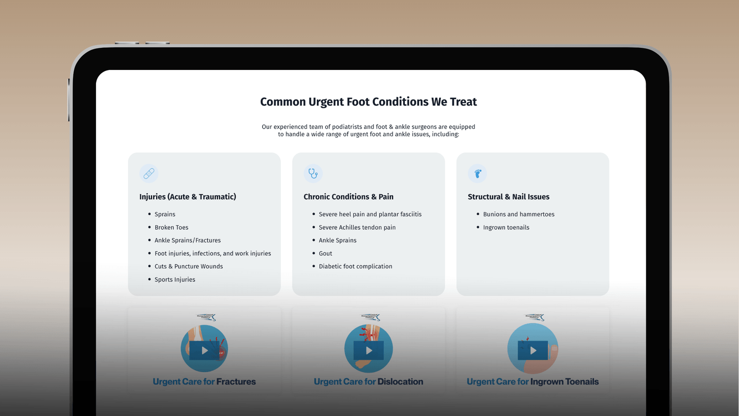
Common issues were grouped into three plain categories — injuries, chronic pain, and structural/nail issues — so patients could self-identify without needing medical terminology.
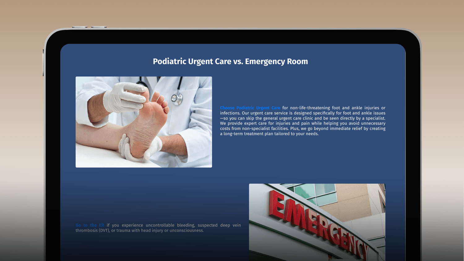
A direct comparison section helps patients decide where to go — podiatric urgent care for non-life-threatening foot and ankle issues, ER for anything more serious — reducing unnecessary ER visits and misdirected calls.
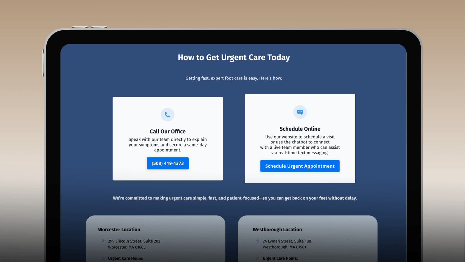
A simple call-or-schedule-online flow, with the booking path tagged separately on the backend so the practice could track urgent care demand on its own.
— REFLECTION
What I'd carry into the next project
WHAT I LEARNED
Already knowing the client's patients made a three-day build possible without skipping the thinking — the research happened before the project started, not during it.
WHY THESE DECISIONS
Keeping the page separate from the main site wasn't just a design choice — it's what made it possible to tag and count urgent care leads on their own for the first time.
IF I IMPROVED IT FURTHER
I'd capture before/after screenshots and a proper analytics view going forward, so results like the day-one traffic share are easier to show, not just describe.
— MORE CASE STUDIES
Other projects worth a look.
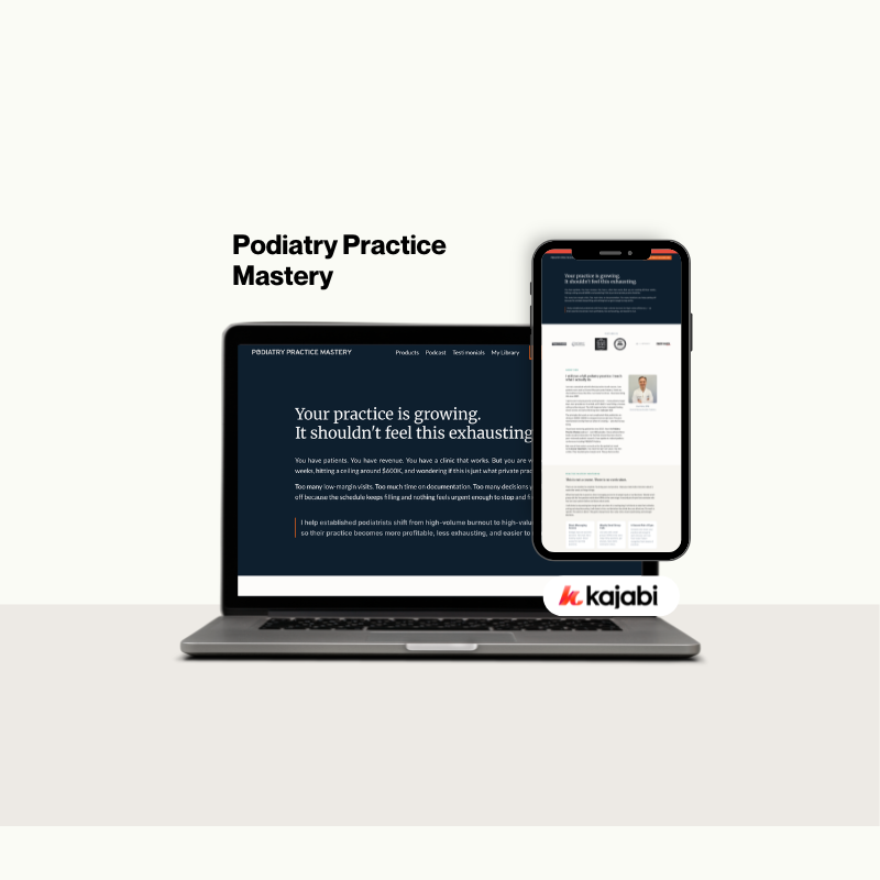
Built a membership website that helps podiatrists access training, resources, and practical tools to grow more profitable, efficient practices.
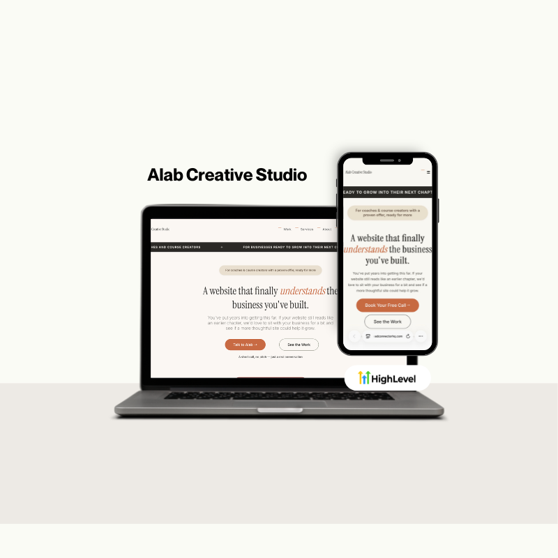
Designed a modern agency website focused on building trust, showcasing expertise, and turning visitors into qualified leads.

Created high-converting lead magnets that educate audiences, strengthen brand authority, and generate quality leads across multiple industries.
Built a membership website that helps podiatrists access training, resources, and practical tools to grow more profitable, efficient practices.
Designed a modern agency website focused on building trust, showcasing expertise, and turning visitors into qualified leads.
Created high-converting lead magnets that educate audiences, strengthen brand authority, and generate quality leads across multiple industries.
HAVE A SIMILAR PROJECT?
Let's talk about it.